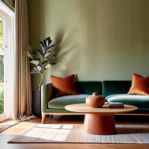
I remember sitting on the floor of my first tiny Manhattan apartment, surrounded by dozens of tiny, expensive paint swatches that all looked exactly the same under my flickering hallway light. I was exhausted from a ten-hour day in corporate finance, staring at a wall of “eggshell” and “cream,” feeling like I was failing a test I never signed up for. I realized then that most design gurus make learning how to choose a color scheme feel like a high-stakes math equation or a luxury service only the elite can afford. It’s incredibly frustrating when the “experts” tell you to follow rigid rules that completely ignore how a space is actually supposed to feel when you’re living your real, messy, beautiful life.
I’m not here to give you a lecture on color theory that requires a degree to understand. Instead, I’m going to share the practical, soul-centered approach I use to create environments that foster both productivity and peace. We are going to skip the expensive mistakes and focus on how to build a palette that reflects your unique energy and supports your well-being. Consider this your no-nonsense guide to finding colors that actually make you feel at home.
Table of Contents
- Mastering Interior Design Color Theory for Daily Balance
- Harnessing Room Mood and Color Psychology for Peace
- My Five Golden Rules for a Palette That Actually Feels Like Home
- Your Color Compass: 3 Lessons for a Balanced Space
- ## Beyond the Swatches
- Painting Your Path to Peace
- Frequently Asked Questions
Mastering Interior Design Color Theory for Daily Balance
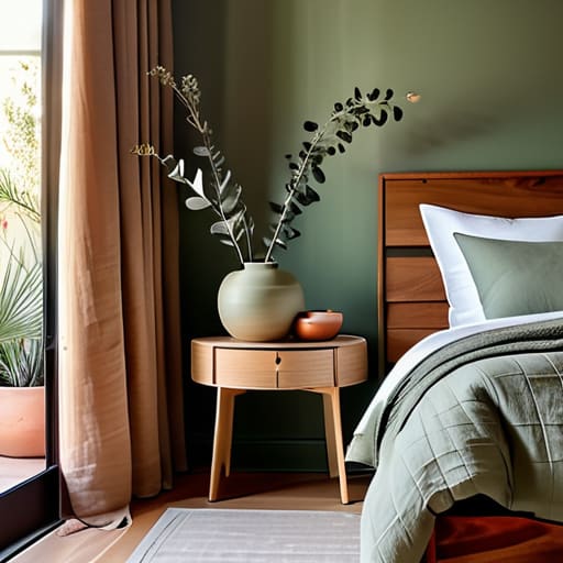
Now, let’s dive into the actual “why” behind the colors we pick. Understanding interior design color theory isn’t just for people with fancy degrees; it’s actually a secret weapon for managing your mental energy. Think of your home as the ultimate recharge station for your career. If you’ve had a high-octane day navigating corporate politics or tight deadlines, the last thing you need is a bedroom that feels like a neon-lit nightclub. By leaning into room mood and color psychology, you can strategically use hues to signal to your brain that it’s time to decompress.
For instance, if you’re looking to create a sanctuary, I always suggest exploring complementary color combinations that offer a sense of equilibrium. If your living room feels a bit chaotic, playing with monochromatic color schemes can act like a deep, cleansing breath for your eyes. It’s all about creating a visual flow that supports your lifestyle rather than draining it. Remember, your space should work just as hard for your well-being as you do for your paycheck!
Harnessing Room Mood and Color Psychology for Peace
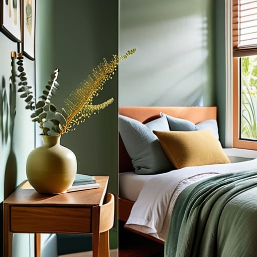
Think of your home as the ultimate sanctuary for your mental well-being. Just like how I use mindfulness meditation to center myself after a hectic day in the city, you can use room mood and color psychology to curate an environment that actively lowers your cortisol levels. For instance, if you’re looking to turn your bedroom into a peaceful retreat, leaning into soft blues or sage greens can signal to your brain that it’s time to decompress. On the flip side, if you’re working from a home office, a splash of warm yellow or energetic orange might provide that much-needed cognitive spark to tackle your morning meetings.
It’s also about finding that sweet spot between stimulation and serenity. If you’re feeling overwhelmed by too much visual “noise,” I always recommend experimenting with monochromatic color schemes. Using varying shades of a single hue creates a sophisticated, seamless flow that feels incredibly grounding. However, if you want a space that feels more social and vibrant, playing with complementary color combinations can bring a lovely, rhythmic energy to your living area. Remember, your walls shouldn’t just look pretty; they should make you feel at home.
My Five Golden Rules for a Palette That Actually Feels Like Home
- Start with your “anchor” piece. Whether it’s that vintage rug you found in a Brooklyn thrift store or a painting that makes your heart sing, pick one item you absolutely love and build your colors around it. It’s much easier to find colors that complement a physical object than it is to force a rug to match a mood board!
- Follow the 60-30-10 rule to avoid visual chaos. Think of it like a well-balanced budget: 60% is your dominant neutral, 30% is your secondary color, and 10% is that “pop” of personality. This keeps your space feeling intentional and professional, rather than just a random collection of paint swatches.
- Don’t forget the “Golden Hour” test. Before you commit to a gallon of paint, swatch it on different walls and watch how the light changes from the bright morning sun to the cozy evening glow. A color that looks like a dream at 10 AM might feel a little too intense once the sun goes down.
- Use texture to add “visual quiet.” If you’re working with a very minimal color palette, don’t panic! You can prevent a room from feeling flat by layering in different textures—think a chunky knit throw, a smooth wooden coffee table, or a linen curtain. It adds depth without needing to add more “noise” through color.
- Check your emotional ROI. Ask yourself: “How do I want to feel when I walk into this room?” If you need a space to decompress after a high-stakes meeting, lean into those calming blues or soft greens. Your home should be your sanctuary, not another place where you feel overwhelmed by sensory overload.
Your Color Compass: 3 Lessons for a Balanced Space
Think of color as your emotional thermostat; don’t just pick shades that look “trendy” on Pinterest, but choose hues that actively regulate your mood and keep your stress levels in check.
Use color theory to create zones of intention, pairing high-energy tones in your workspace to fuel productivity and soft, grounding palettes in your sanctuary to facilitate true rest.
Remember that harmony isn’t about perfection, it’s about flow—select a palette that feels as cohesive and restorative to your spirit as a well-structured financial plan or a deep yoga flow.
## Beyond the Swatches
“Choosing a color scheme isn’t just about matching your rug to your pillows; it’s about curating an emotional landscape that supports your hustle during the day and invites your soul to exhale at night.”
Lena Anderson
Painting Your Path to Peace
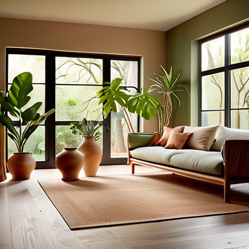
As we wrap up our journey through the world of hues, remember that choosing a color scheme is so much more than a simple decorating task; it is an investment in your mental well-being. We’ve explored how mastering color theory can bring structural harmony to your home, and how tapping into color psychology can transform a chaotic room into a sanctuary of stillness. Whether you are leaning into the grounding energy of earthy tones or the uplifting vibrance of sunny yellows, the goal is to create a space that supports your daily rhythm. Don’t feel pressured to follow every rigid rule you see in a design magazine; instead, use these principles as a compass to guide your intuition toward a home that truly breathes with you.
At the end of the day, your home should be the ultimate reflection of the life you are building—one that prioritizes both ambition and rest. Just like a well-balanced financial portfolio or a steady yoga practice, a thoughtful color palette provides the stability you need to flourish. I want you to approach this project with curiosity rather than stress. Let your space be a canvas that celebrates your journey and fuels your soul. Remember, you aren’t just picking paint colors; you are curating an environment for joy. Now, take a deep breath, grab those swatches, and start creating the life you love, one shade at a time.
Frequently Asked Questions
I love the psychology behind these colors, but how do I actually pick a palette that won't make my small apartment feel even more cramped?
I totally hear you—nothing kills a zen vibe faster than feeling like your walls are closing in on you! When you’re working with a cozy footprint, think “light and airy.” Lean into soft neutrals or cool tones like pale blues and sage greens; they act like visual breathing room. Also, pro tip: try a monochromatic scheme. Using different shades of the same color creates a seamless flow that tricks the eye into seeing more space.
Is it better to stick to a strict set of colors, or can I mix in a few "wild card" shades without ruining the whole vibe?
Oh, I love this question! It’s like trying to balance a strict budget with a little “treat yourself” fund. If you stick too rigidly to one palette, your space might start feeling a bit stale—kind of like a job without any creative wiggle room. I say go for it! Throw in a “wild card” shade to add personality and spark. Just think of it as a pop of joy that keeps your environment feeling alive and balanced.
How do I balance my personal favorite colors with the colors that are actually going to help me stay calm and focused during a long workday?
Think of it as a “color compromise.” I love a bold, spicy terracotta as much as anyone, but staring at it for eight hours might leave me feeling a bit too wired! Try the 60-30-10 rule: let calming, focus-driven neutrals (like soft sages or blues) take up the heavy lifting of your space, then sprinkle your favorite vibrant hues in through accents like pillows, art, or even your coffee mug. It’s all about that sweet, balanced harmony.